Map visualisation: see where the news happen
Today, we want to show you our newest feature, the map visualisation:
This feature is included in our AI Package and allows you to change between the normal view in the News Browser and the map view. In this view, you will be able to see the news as pins in the areas where the news happened, when passing the mouse over the pins the titles will appear. It is possible to zoom in and out for greater accuracy, and by clicking on the news item you will see a preview of it (Like in the normal view). You can set filters in either display, and the filtered stories will be shown on the map, like priority or source.
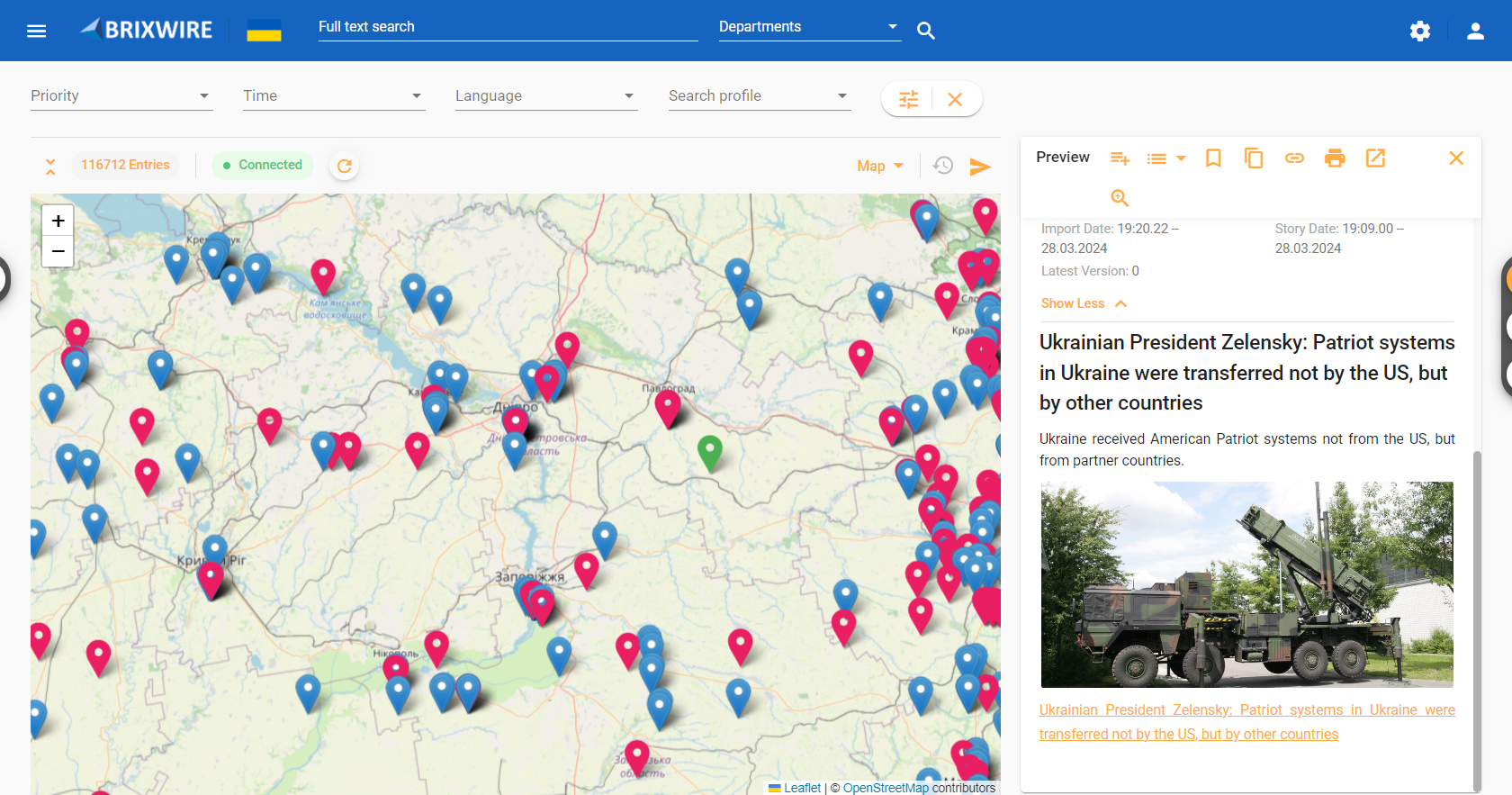
It is possible to differentiate the news in three categories depending on the colour: red for news with priority type 1, blue as the default colour and green for the news selected for preview.
How does it work?
In this video, we show you how it works:
What are the benefits of it?
- Enhanced Geographic Understanding: Visualize news events on a map for better context and insight into where stories happen.
- Improved Storytelling: Visualize news events on a map to tell more compelling and informative stories, enhancing reader engagement and understanding.
- Efficient News Gathering: Quickly identify trends and hotspots, streamlining the newsgathering process for journalists.
- Data-driven decision-making: Set filters to prioritize coverage based on geographic distribution, enabling smarter editorial decisions.
- Competitive Advantage: Stand out with innovative map visualisation, showcasing a commitment to cutting-edge technology and storytelling.