It is time for an upgrade!
Dear journalists and editors using Brixwire:
Some of you have worked with Brixwire since 2015. You stayed loyal to us when we were still an ugly duckling. We believe that you deserve more. Therefore, we have changed our frontend technology and built it again to give you the best experience.

Today I want to share with you the main changes:
- The upgraded Newsbrowser
- Shortcuts and navigation
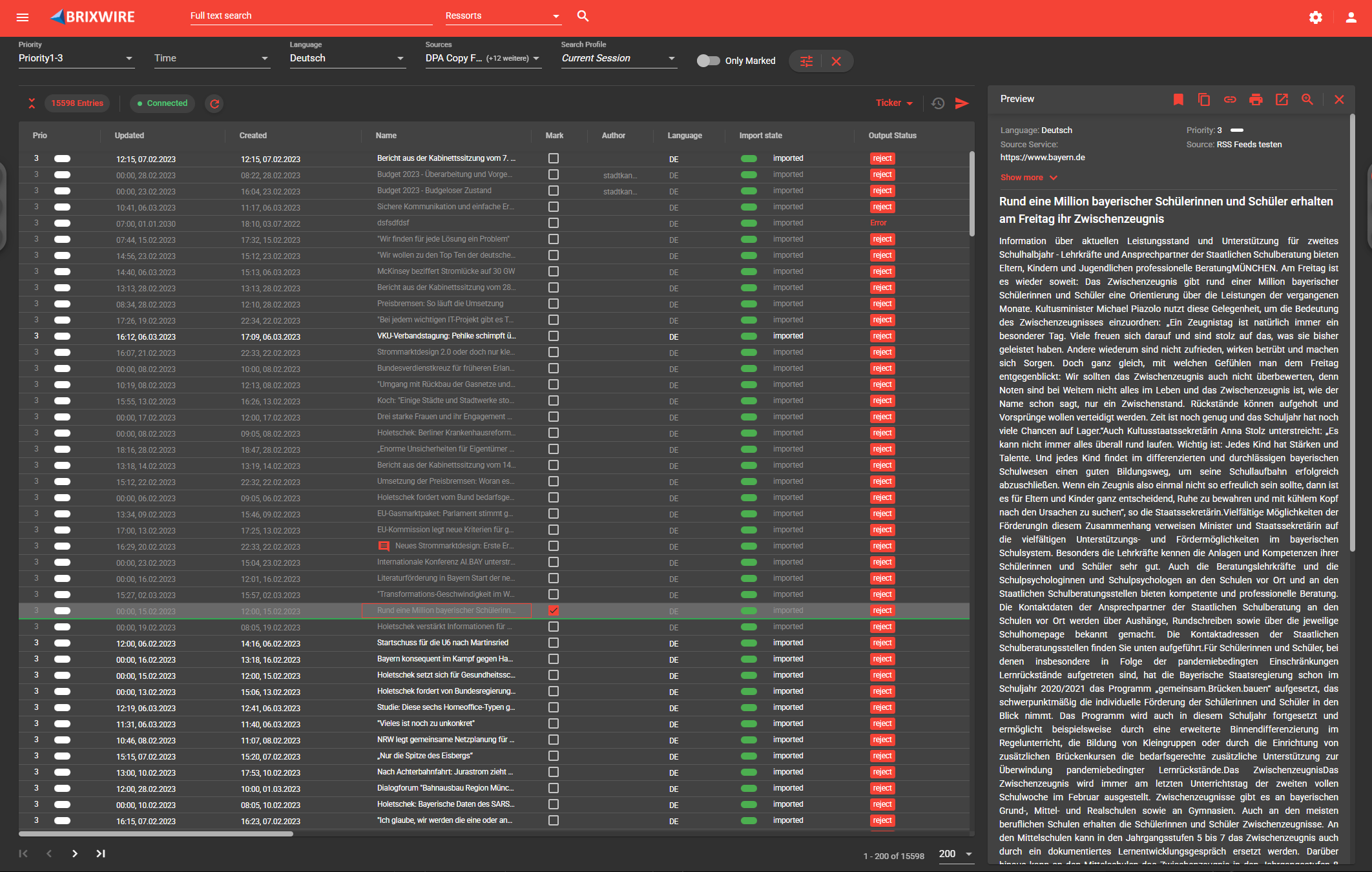
- New themes and dark mode
The upgraded Newsbrowser
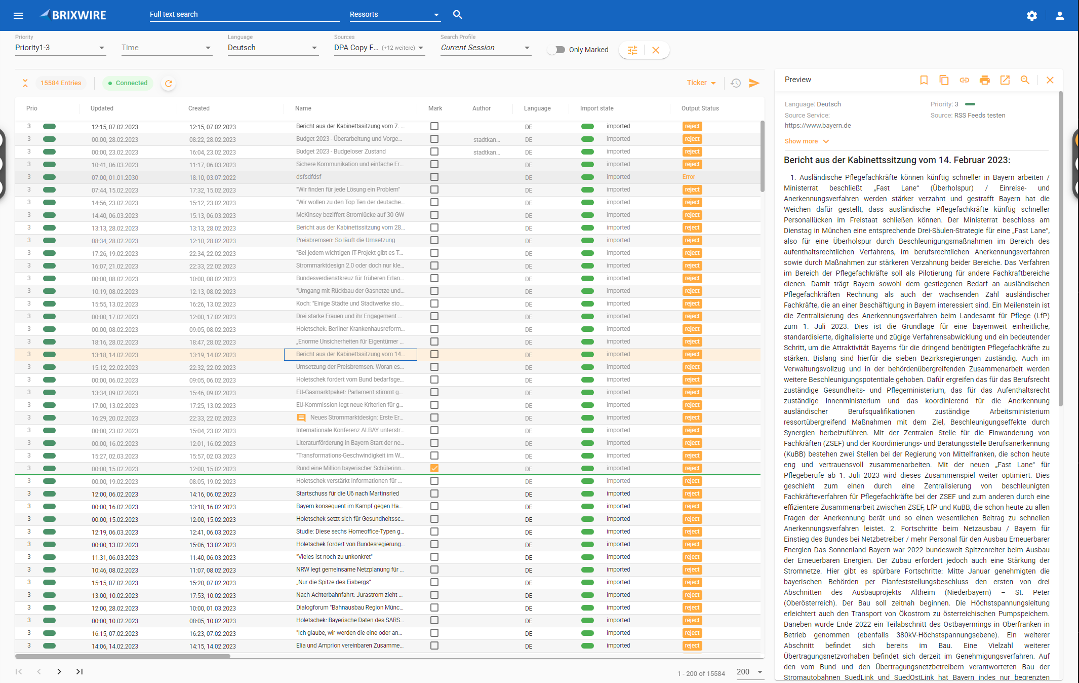
We have changed our frontend technology to Angular, which provides several benefits.
As the Application is divided into individual components, the development of a feature is capsuled, which improves the ability to test and maintain code. Therefore, we can provide safer software with fewer bugs.
Also, the application is faster than the old one, as unused components are not loaded and redundancies are eliminated.
Shortcuts and navigation
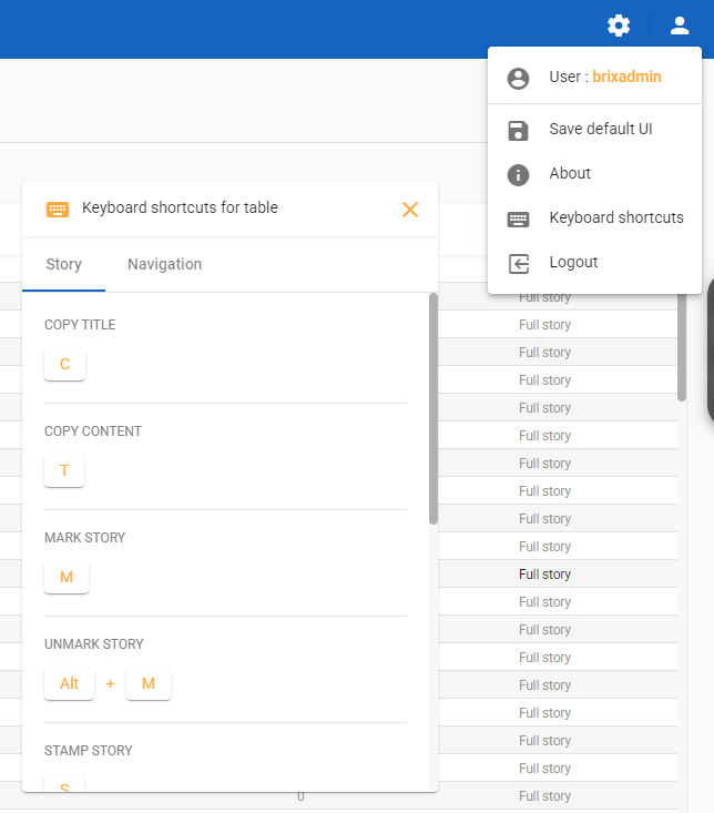
The new front end is built for productivity and offers shortcuts and keyboard navigation for efficient users. As an example, you can navigate the table with the arrow keys. If you like a story, you can export it by pressing “e”, mark it by pressing “m” and so on. You can see the full list of shortcuts by clicking on the user icon -> Keyboard commands.
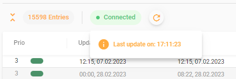
Also, the application is designed to give the user instant feedback for successful and failed actions, which makes the application feel more alive. As an example, we have included a “Connected” section, which informs the user about the connection to the backend and the last update.
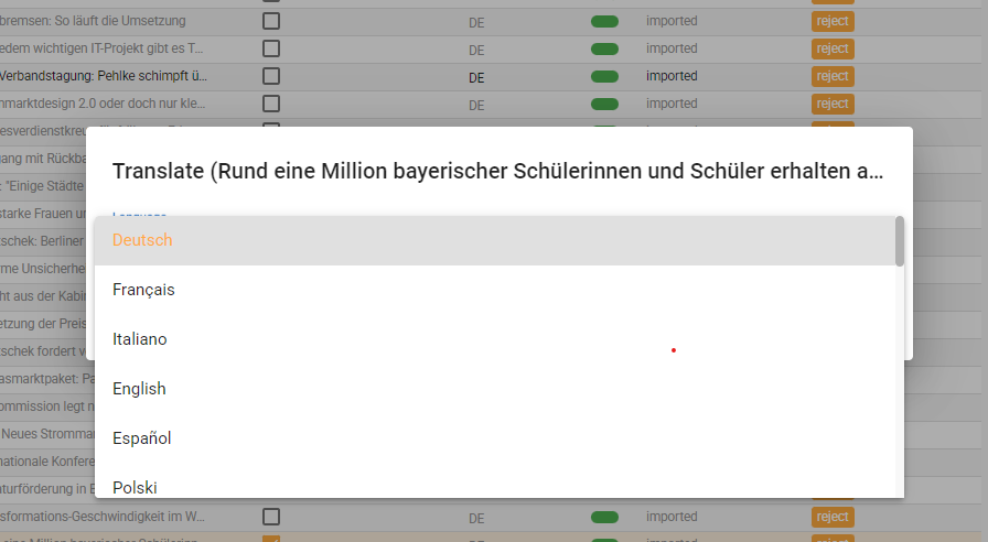
The old frontend is no longer supported, this means new features such as translations for foreign stories are exclusive to the new version.
New themes and dark mode
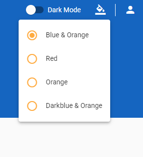
Last but not least, the new frontend offers multiple themes for every taste and a dark mode for the night owls:
You can change your theme and enable dark mode under the user profile section:
If you want to test the new version yourself, you can request a demo with us: Contact.
By: Leo Schwertführer
