“No one cares about the UI!”

When working with business software in the development area, there are some possibilities you have already heard this phrase before. So did I. Whenever we thought about bigger changes in the front-end, we heard sentences like “we must focus on additional features, cover more use cases and provide more direct value for our customers.
They, “the customers don’t care about the UI as long as our software helps them”, or “the biggest companies in the B2B sector mostly have a bad UI, because the decision-makers don’t care about how it looks, they only care about what problems it solves”.
As a result, the front end was a secondary priority for us for a long time, our UI should simply be stable and cover all features we developed. We were developing new features nonstop, focused on the architecture, security, and other complex technical questions. UI Design was one of the last things on the priorities list.
Nevertheless, my colleagues and I always had a deep interest in design and usability. We would regularly send each other examples of the best and the worst implementations, analyze, and discuss everything until we could tell what exactly makes them good or bad.
The problem
When we started our product BrixWire News Hub in 2016 the focus was to develop a stable and expandable ecosystem. The resources for front-end development were limited and just followed the current requirements. Angular, Vue, React, and other front-end frameworks either just came up or it was not clear to see if they are sustainable. So, we developed the front-end with the usual approaches at that time (Razor views, JavaScript, jQuery, and Bootstrap).

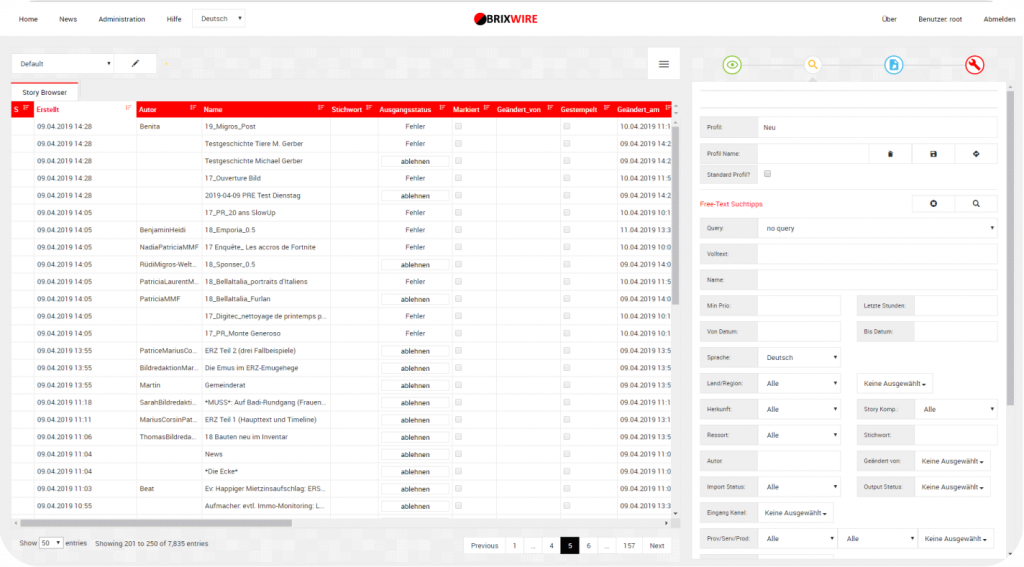
The “Problem” was that BrixWire was so well received from our customers that we provided more and more features and grew our ecosystem. While the back-end was built on a stable foundation with an expendable and open structure, the front-end was getting old and the technology couldn’t handle the development of the new features.
As a result, the UI felt slow and old. We developed several design and performance updates that made the user experience better but did not solve the underlying problem. We had a high-performance engine with the body of a not-so-well-aged middle-class car. We became frustrated, the UI did not represent the idea, the team, and the power behind BrixWire.
We started to look for a technology to give the next step on the UI development and we found three main options React, Vue, and Angular. React works better for smaller projects, Vue did not show to have a big community where you get support and solve daily problems as when you have a bigger community working with a technology, you find training material, discussions, answers, and examples to learn from.
Then we came to Angular because it supports bigger architectures, and has many benefits like reusability, readability, Unit-Test friendly, maintainability, and stability. Also, Angular is very popular and has a big community working with it, another point that led us to the choice of this technology.
The second spring
When we started to develop the new front-end from scratch with Angular at the end of November 2020 it felt like a second spring.
We had a clear goal in mind: Building a front-end which not only exists to transport the functionality of the back-end to the everyday user but brings usability, joy, and simplicity. We set out to create something that would amaze us.
The challenge
We learned from the past: Building the front-end for a powerful application needs planning and a clear vision. With the experience gained from the past we knew exactly what was important when developing a front-end for a feature-rich application like BrixWire:
- A solid structure
- Reusable components for repeating use cases
- A concept for state management
- Reduction of memory
The development itself was a lot of fun for us. We had a challenge and a goal. We both loved it to put all our energy and creativity into the development. We now have new APIs and highest standards in the industry on security matters.
In summary, it was a very motivating experience to see everyone bringing their expertise and giving two hundred percent to achieve the common goal.
The result

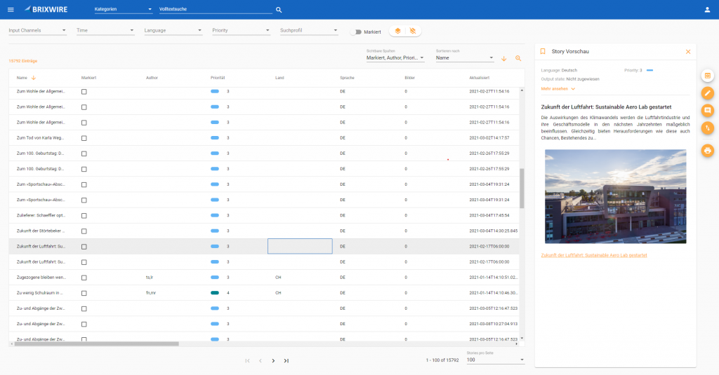
We can confidently say that we have met our claims. The new UI application can be described by the following core properties:
- No complexity for the everyday user: You won’t need an explanation on how to use BrixWire.
- BrixWire brings joy by simplifying your workflow.
- BrixWire is intuitive to use, if you expect to do something a certain way you will be able to do it.
- BrixWire responds to your actions, there won’t be any moment of doubt if your action was successful or not.
- Keyboard enthusiasts will love how useful shortcuts and logical keyboard navigation supports the workflow and increase productivity.
- BrixWire is faster and smoother than ever.
- An unobtrusive but beautiful design.
- And the most important one: You can tell that BrixWire is made by people who love working on it and take responsibility for the outcome.
After all this adventure, if I hear again someone saying that UI doesn’t matter, I have the proof and the arguments to say that it does!
The UI is the face of that product that helps to solve the customer’s problems, so we should not think that they only look at the problem it solves, but also at the experience and the way customers interact with the software. And when the experience is positive, and the product fulfills its objective, is when the customer is really satisfied with the developed product.
By: Leo Schwertführer
